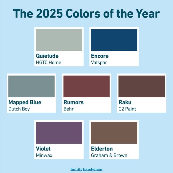
Check out the 2025 Colors of the Year from top paint brands; and find out where to use these dark, sophisticated colors in your home.
It may seem early, but we’re already seeing brands release their 2025 colors of the year. It’s a great time to see what colors are trending and which one might be a good fit for your upcoming paint projects. Interior design, in general, has been leaning towards moody interiors full of character and antique-inspired pieces, and the current colors reflect that movement. Dark hues that make a big statement dominate the list, with rich browns, earthy reds, and dramatic blues and purples.
We’ve gathered up all the 2025 colors of the year we know so far so you can see what to expect next year. We also spoke to interior designer and paint color expert Bree Steele to get her insight on why these colors made the list, and where they could best be used in your home.
AGRIMA SHARMA/FAMILY HANDYMAN
1/7
FAMILY HANDYMAN, GETTY IMAGES
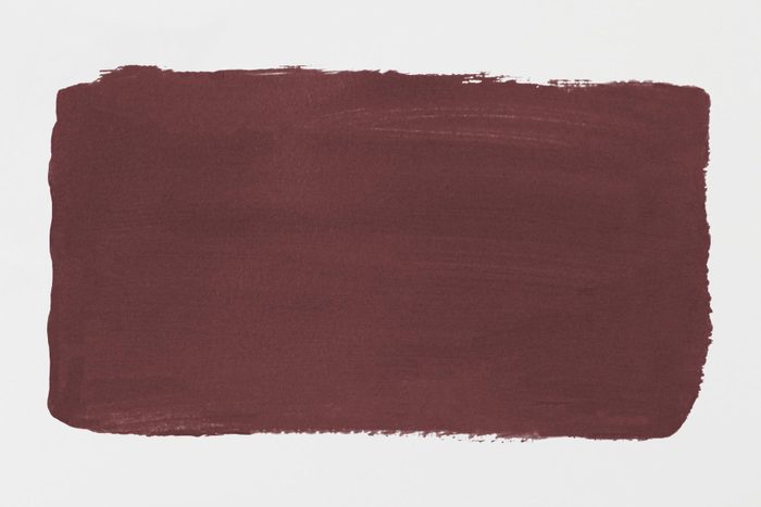
Rumors by Behr
Back in the ’90s, maroon accent walls dominated interiors—and Rumors is the new and improved version of that color. It’s a deep ruby red that will add warmth and rich allure to a space, as Behr describes it.
How to Use It
“This color, in particular, feels luxurious and warm, which makes it a perfect color if you want to make a statement,” says Steele. “The best places to use it will be in the dining room, an office, or a library. When paired with gold or brass accents, the room will feel very sophisticated, even if decorated on a budget.”
2/7
FAMILY HANDYMAN, GETTY IMAGES
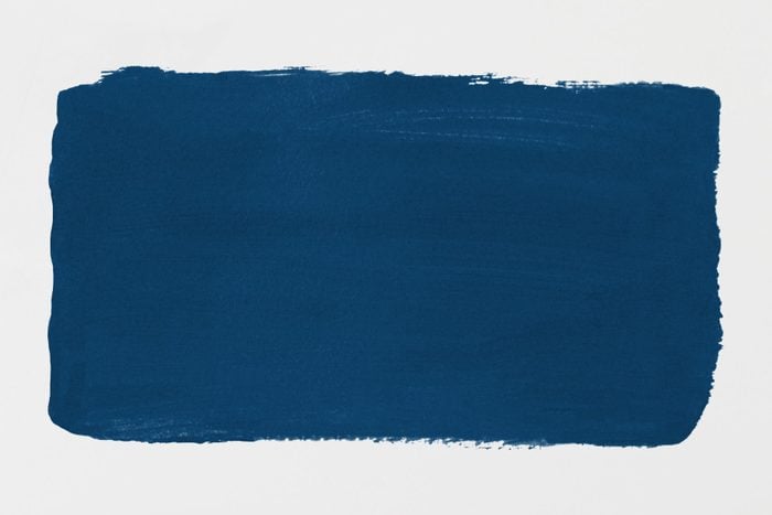
Encore by Valspar
Encore is a saturated blue with violet undertones. According to Valspar, the anchoring color embodies confidence and joy. It’s a vibrant shade that makes an impact, but not too bright that it distracts the rest decor.
How to Use It
This color fits well with those who want to make their home feel more personalized and bold, but a little goes a long way. Limit it to one room or as an accent color. “With this shade, it alludes to confidence, which is a great color to use in a room like the dining room or in a home office,” says Steele. “Used as an accent color, the room will feel grounded and sharp.”
3/7
FAMILY HANDYMAN, GETTY IMAGES
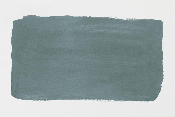
Mapped Blue by Dutch Boy
If you’re not a fan of ultra-dark colors, Mapped Blue is a good choice because it’s lighter than most the other colors on this list while still making an impact. Dutch Boy describes it as a medium-tone blue with slight yellow undertones. It’s a dynamic color that can look blue or green, depending on the light and time of day.
How to Use It
“Mapped Blue has an earthy and grounded tone, which makes it perfect for modern spaces that want to feel more connected to the outdoors,” says Steele. “Because it’s a lighter shade, it will make a room feel more open (which is perfect for smaller spaces). The welcoming feeling the color creates makes it great to use in kitchens or bathrooms and will pair well with white cabinetry.”
4/7
FAMILY HANDYMAN, GETTY IMAGES
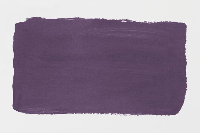
Violet by Minwax
Unlike the other 2025 colors of the year, Violet by Minwax is actually a wood stain instead of a paint color. Staining furniture purple might not be your first instinct, but this color will give your piece a whimsical and modern look that’s surprisingly charming. You can also experiment with different saturations by using as few or as many layers of stain as you want.
How to Use It
“The Violet by Minwax wood stain is a great alternative to typical neutral tones, giving you a sophisticated alternative with a colorful twist,” says Steele. “If you’re looking to elevate your room without painting the walls, this wood stain will be a great alternative for adding a colorful pop to your wooden furniture and will look great on a side table or a bookshelf.”
5/7
FAMILY HANDYMAN, GETTY IMAGES
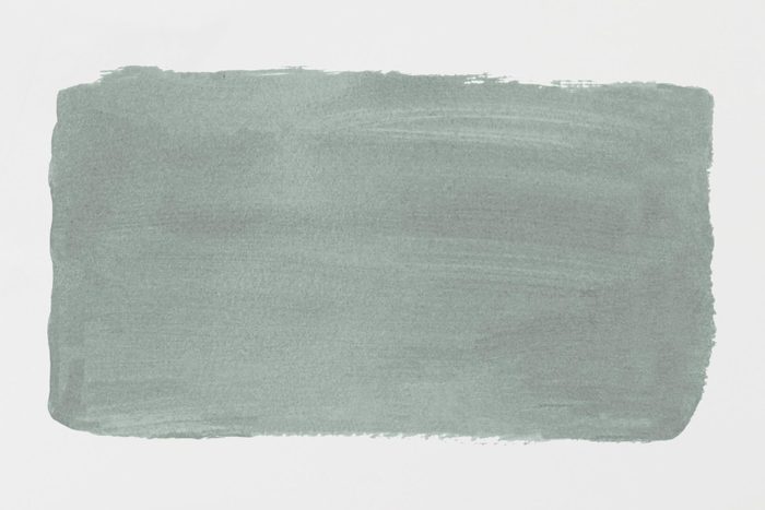
Quietude by HGTV Home by Sherwin Williams
Quietude is another color for those who want something on the softer, lighter side. It’s a muted sage with blue undertones that will help you create a tranquil space. It pairs well with other nature-inspired colors like sandy browns, creamy whites and pale yellows.
How to Use It
“The Quietude shade by Sherwin Williams is similar to the Mapped Blue in the sense that it alludes to the outside environment, making a room feel reconnected with nature. This makes it a great color to create a peaceful room, making it fitting for a bedroom or bathroom. If you want to pair it with light woods and natural greenery, the room will feel more relaxed,” says Steele.
6/7
FAMILY HANDYMAN, GETTY IMAGES
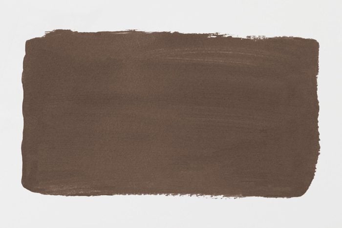
Elderton by Graham amp; Brown
For a perfectly balanced brown, look no further than Elderton. Inspired by the deep brown leaves on an Elder tree, Elderton is a timeless color that will add interest to any room. The woodsy hue never looks red, which can be a risk when choosing a brown paint color. Instead, it’s rich and perfectly neutral so you can paint with confidence.
How to Use It
Dark colors like Elderton look best when used with the color-drenching technique. Instead of applying the color to only the walls, create a striking effect by using it everywhere—on the walls, ceilings, and even the baseboards and doors. Color-drench Elderton in a dining room, media room, or a powder room for a bold and sophisticated look.
7/7
FAMILY HANDYMAN, GETTY IMAGES
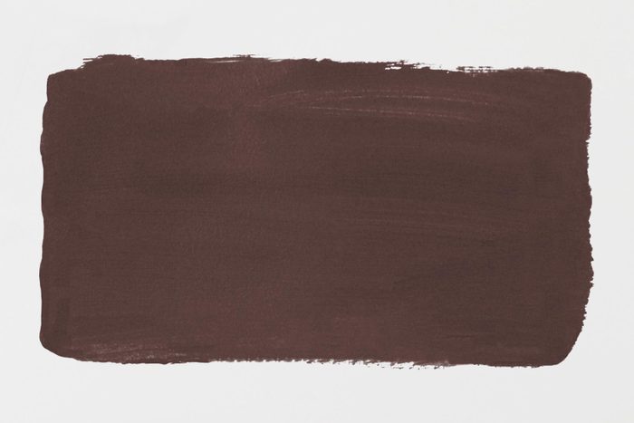
Raku by C2 Paint
Similar to Rumors, Raku is a deep, dramatic red reserved for only the bravest painters! C2 Paint describes it as “an earthy, burnt, brownish red with oxidized undertones that infuse spaces with drama and intimacy. It’s a deep yet vibrant tone with dynamic undertones of rich mahogany that exude a sense of security, simplicity, and sophistication.”
How to Use It
Use this color anywhere you want to emulate a cozy cocoon of dark, warmth. It will transform extra small rooms like mudrooms and powder rooms into an unexpected jewel. In larger spaces like a bedroom or living room, the color feels luxurious and chic. Bring in dark leather furniture and walnut wood tones to create a monochromatic reddish brown space with layers of texture and dimension.
About the Expert
- Bree Steele is an interior designer and color expert at RJ Living. Steele has been in the industry for over a decade and has styled homes, Airbnb’s, and commercial spaces. She’s passionate about helping people create their dream spaces through their interior choices and paint colors.
Originally Published: September 17, 2024
Author
Erica Young
Erica Young is a freelance writer specializing in home trends and lifestyle topics. Erica contributes regularly to Family Handyman and Taste of Home. Her byline has also appeared in POPSUGAR, The Belladonna, Your Tango, The Organized Mom, Reader’s Digest and Curbly.

